
GDE 710
WEEK 2
Industry today
How did we get here?
This week started with a very important inquiry, a looking back at history to understand how we as designers have arrived at where we are today. The context in which we perceive information affects how we interpret it, so it becomes necessary to know what that context is. History gives us that. I found the conversation with Susan and Maziar a great way to start that line of inquiry off.
Which creative studios contribute to the identity of your city’s design industry and how?
In conversation with Susan and Maziar

Yeah I think history is fundamental to our understanding of our practice and I think those people who ignore it, especially in this generation of students..., where the availability of imagery is always there but not the context, not the history, not the deep knowledge of this generation and the situation in which it was produced. Now that can be a little bit worrying for me...
Maziar Raein
I really enjoyed the conversation with Susan and Maziar. It really felt like I was in the room with them. The ease and clarity with which they went back and forth recounting the history they experienced was very refreshing. It provided a very nice backdrop to the inquiry of history which at times can get dry, theoretical and boring. There was a form of storytelling, like a fireside chat. It also worked well to set the mood into my own inquiry of Canada's graphic design history later in the week.
Susan and Maziar's reflections about how design was changing in the 80s when they were both practitioners was very illuminating. What impressed me was the role of designers in changing the landscape of the time, whether politically or by using their voice and work to communicate powerful messages. The contrast of how practice shifted from a focus on craftsmanship where the role of the designer was prescribed to an independant kind of expression that could provoke thought was eye-opening for me.
Maziar's reflection about the 80s being split into 2 distinct periods made me appreciate the evolution that was happening. I later connect this observation with design history in Canada, but during an earlier period of the country's design history, the 60s and 70s. What really struck me is how without globalization in the past, different parts of the world went through the same kind of evolution but at different rates. And what I'm left with as a designer, is the need to go back and inquire more about the history of graphic design in Europe, Canada, the subcontinent of Pakistan and India, and even of the Arab world. Since these are all influences that shape me. So in that sense this week's material has given me a lot to think about and research at a later time.
Maziar and Susan highlighted a few practioners well known in that time, and while I'd love to reflect on all of them, I chose two to write about as part of this week's reflection.
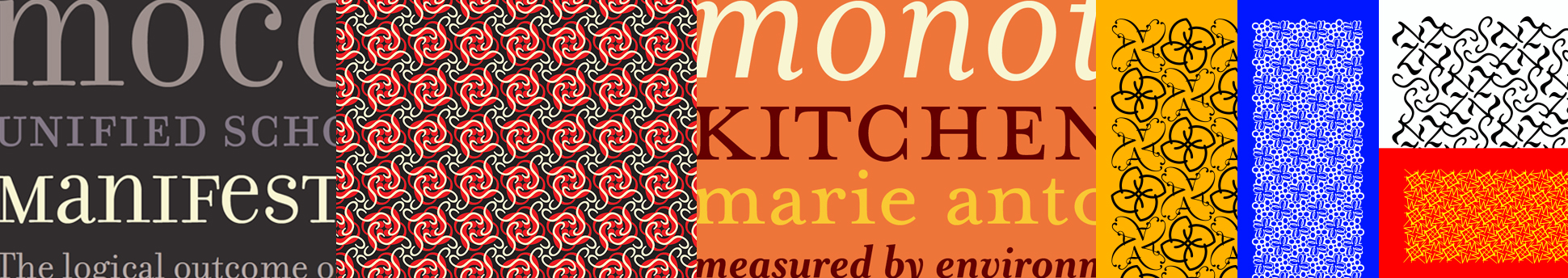
Corita Kent — 60s to 80s Modernism

She was a Catholic nun..., but she was truly independent and a revolutionary in the sense that she was working for the poor and producing graphics that supported… humanist messages… absolutely and caring for society, but they were kind of rare.
Maziar Raein and Susan Edwards
I was absolutely awestruck with Sister Corita Kent's work. It resonated with me on so many levels! I'm quite excited by how much seeing her work has opened up for me as a designer. The first thing that struck me was how bold, warm and human her work was. I would never have guessed that she was a nun by her work. I would have expected it to look a bit more inspired by Christian aesthetic of the time. The fact her work looks so modern, makes it so familiar, timeless and relevant even today. The fact that she used these screenprints as a means to communicate messages of faith by urging viewers to consider "poverty, racism, and injustice in society" is very inspiring to me personally. Working in the Muslim community and with increasing Islamophobia in the world, as a designer my own work has balanced warm and bold to communicate Islamic themes in ways that look relevant today. I think her work really speaks to the expressive nature of graphic design. How feelings, emotions and tonality can be comunicated in the shaping of a piece, and really tap into the universal language we all share, in that sense it transcends the bounds of the intellectual realm only, for me. In my opinion this is what makes her work so powerful. You can feel it.
EMIGRE • Zuzana Licko — 80s, 90s Post Modern
The ‘Emigre aesthetic’ lay at the heart of a once-controversial battle on the American design scene, pitting them against Modernists such as Massimo Vignelli, who referred to the new typography as ‘garbage’. The debate did little to slow the popularisation of the Emigre fonts, which by the late 1980s had moved beyond alternative pop cult status into the mainstream.
Emigre or rather Zuzana Licko's work is simply beautiful! Even before I knew about Licko, her work had caught my eye visually. Ms Eaves and Filosophia are one of may favourite fonts. And while I love and emody the simplicity of the Swiss period, the ornamentative quality of Hypnopaedia was not lost on me, infact I was hooked the fist time I saw the font. How Licko had used letter to create motifs that then turned into these beuatiful winding pattern are what made me see the potential of using typography expressively. This is where my love of pattern became intersected with typography. It was a paradigm shift for me as a student of graphic design years ago. I remember taking an assignment where we had to create a font. And I had used that font to create a variety of patterns afterwards. This style is a deeply ingrained part of my expression as a designer.
Key Evolutionary Design Steps That Shaped Canada
This week really had me researching and digging to look at Canada's design history. Most Canadian designers are familiar with Canadian graphic design imagery like the Roots logo or the CN logo, however I had never really gone searching for Canadian design history in particular. During my search I came across a documentary titled "Design Canada" by Greg Durell. When he worked on 2010 vancouver Olympics identity he encountered a vacuum, there was no information about Canada's graphic design history. So in 2017 he decided to create a documentary telling the story about design in Canada. The 60's and 70s laid the foundation for design in Canada for years to come and is often referred to as the Golden Age of graphic design in Canada. Four key steps that defined this evolution and put Canadian design on the map are reflected on in the next few paragraphs.
Step 1: Creating a National Identity
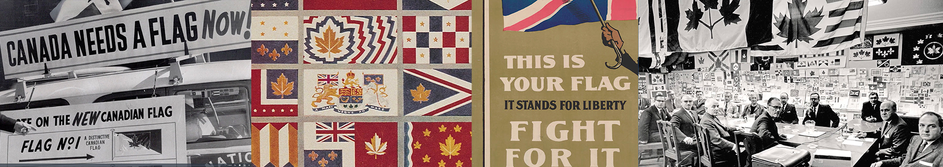
After WWII, Canada had a newfound sense of national identity. Up to that point we were still very much a colony of Britain: Our flag had the Union Jack on it. Everything had a picture of the Queen. Even our mail system was called the Royal Mail Canada.
Greg Durell
The legacy of graphic design began in the 1960s and 70s. In 1963 Lester Pearson ran for President and promised national unity, part of his plan was to provide Canada with a new flag. When he entered office fierce debates began amonst French-speaking and English-speaking Canadians and they public was split into two camps around whether the flag should pay homage to the country's colonial history. Amongst the public, there were also two camps the older folk who thought the flag was fine the way it was with the Union Jack, and the younger generation who wanted a new flag. A commitee was set up to rule on the design of the new flag. Finally in the end a single maple leaf was decided upon. Patrick Ried was asked to make the maple leaf work from a design perspective who then gave it to his best designer Jacques St. Cyr. He ended up creating a clean, elegant, modern symbol that till today is celebrated as a brilliant work of design. Canada had it's maple leaf.

Step 2: Swiss International Style Meets Canadian Design
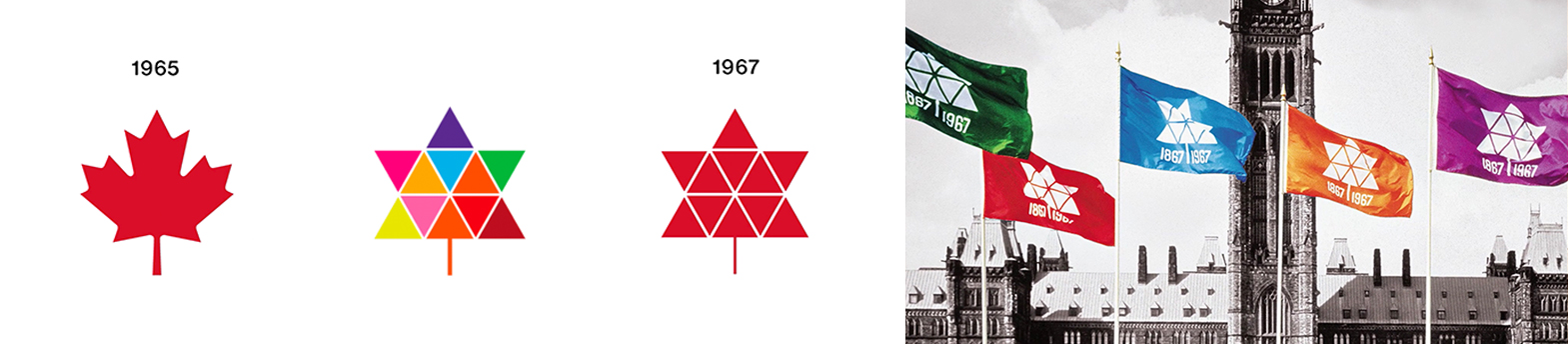
The centennial celebrations in Canada in 1967 marked the 100 year century of Canada's existence. This was a yearlong celebration and during this time the government comissioned graphic designers from Canada and wordwide to create design to show the world that Canada was a cultural destination. During this time Carl Dair a Montreal-based typographer creater the Cartier typeface. This typeface has since then been used so often it is considered the unofficial national typeface.
One famous design that emerged was by Stuart Ash, a Toronto designer who designed the logo for the Canadian centennial. It was a modern depiction a symbol created by using 11 triangles that fit perfectly to create the shape of the Canadian maple leaf. The 11 triangles were multicoloured and represented the 10 provinces + the northwestern territories.
Step 3: Expo '67—Canada Invents Wayfinding Systems
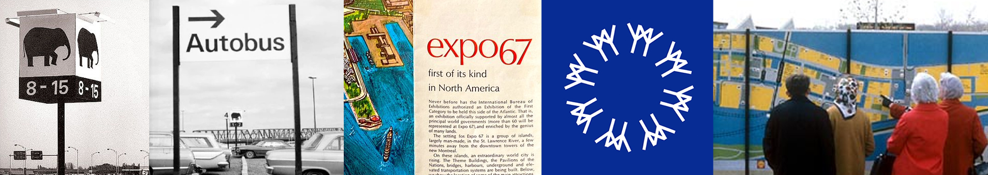
The year 1967 was all about Canada redefining itself, and Expo ’67 became an opportunity to showcase it to the world.
Greg Durrell
Most of Canada's main design talent was studying abroad and Expo '67 brought them back into the country. Canada's most brilliant examples of modernist architecture and design were produced during this time. Expo '67 marked the first example of wayfinding systems being designed. Paul Arthur, a Canadian designer who returned from aboard was influenced by pictograms from 1964 Tokyo Olympics and is credited with coiningthe term "wayfinding." He tasked designer Burton Kramer for designing the 'animal iconography' wayfinding system for Expo '67. Never before had animal icons been seen in parking for people to remember where they had parked their cars.
Step 4: Contrasting Perspectives to the Modernist Design Movement

I think pissed off the modernist, let's say, or anybody who came from that school
of true distilling simplicity. But people loved it. And it said everything about Canada in the most charming, warm way, and I think it became an identity for people, if they wanted to buy something and take it all over the world. They kind of love that part, so it became almost to me like the flag.
Heather Cooper
Most of Canadian designers were heavily influenced by the modernist design movement and International style. However in the midst of this were designers who didn't subcribe to the influence. Heather Cooper brought a female voice and contrasting prespective to the mix. She differentiated design by using he painting skills isnpired by nature to create expressive illustrations for the Canadian Opera. She is best known for the beaver illustration for the Roots logo.
Another voice contrasted the modernist design scene, that of Theo Dimsun. He was known for his Art Deco style posters and is considered one of the most innovative designers in the world. He also created stamps for Canada Post.
Challenge 1: Design Practice
Jacknife Design — Branding and Design Agency

COMPANY STATEMENT: Jacknife is a diverse team of creative problem solvers, built to meet the challenges of modern business. Championing the process of design thinking is how we create and renovate brands, develop innovative products or experiences, and ultimately effect positive change. We’ve learned through experience that you simply cannot understand a brand, the people who buy into it, and the market in which it exists without adopting a truly holistic mindset. Our ability to come at a project from every angle, every perspective…this is where we excel. Our best work is the product of collaborating with clients who share our passion for great design. We believe and our clients know, that our work delivers business results.
Jacknife Design is a studio that was formed when two well-known design studios Amoeba Corp and Oxygen Design merged to found Jacknife. Their main focus is on branding and identity, however they also provide services in design, digital, production, strategy, content, advertising, and environments.
Hambly & Wooley — A team of multidisciplinary designers

COMPANY STATEMENT: Hambly & Woolley is a team of multidisciplinary designers, thinkers and listeners. We offer elegant, often surprising, solutions to questions you may not have even thought to ask. With both experience and freshness, our firm has grown in scope, recognition and reputation over more than 25 years, working in the public and private sectors on projects of all sizes.
Hambly and Wooley is a boutique design studio they mainly do branding and editorial work. Their other offerings include environmental, publications, interactive and work for not-for-profits.
John St. Advertising

COMPANY STATEMENT: We use strategy, design, technology and advertising in every form (social, digital, experiential) to help clients transform their brands and make them meaningful and relevant. Our mission is to make our clients’ brands unignorable. We use insight, analytics, intuition and sweat to do it. But we mostly use sweat.
John St. Advertising is located in Montreal and in Toronto. Their an advertising agency that focuses more on digital and experiential design. Their other offerings include marketing and social media design.
Challenge 2: Design Production
Anstey Bookbinding

COMPANY STATEMENT: Anstey is the epitome of low-tech and old-fashioned. We believe in the hand in “hand-crafted” and are proud to use traditional and innovative binding and finishing techniques. Anstey works with many of Canada’s leading designers, brands, agencies and printers to engage target markets at a deep emotional level through the use of fantastically finished print communication.
WHAT THEY DO: Letterpress printing • Embossing + Debossing • Foil printing • Foil stamping • Edge colouring • Folding • Laser cutting • Gilding • Sewing • Binding
Colour Code Printing

COMPANY STATEMENT: Established in 2012. Colour Code is an independent print studio and publishing platform based in Toronto, Canada. We specialize in high quality, artist friendly printing for local, US and international customers. We also publish and distribute small-run artist books, comics, posters and other printed matter which you can find at our shop.
WHAT THEY DO: Risograph • Screenprinting • Thermography
Trip Print Press
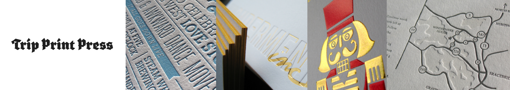
COMPANY STATEMENT: Trip Print press is a printing office. Purveyors of custom contemporary and traditional letterpress printing. Specializing in fine packaging, business and social stationery, artist editions, reproduction proofs, and ephemera.
WHAT THEY DO: Letterpress • Embossing + Debossing • Foil printing • Foil stamping
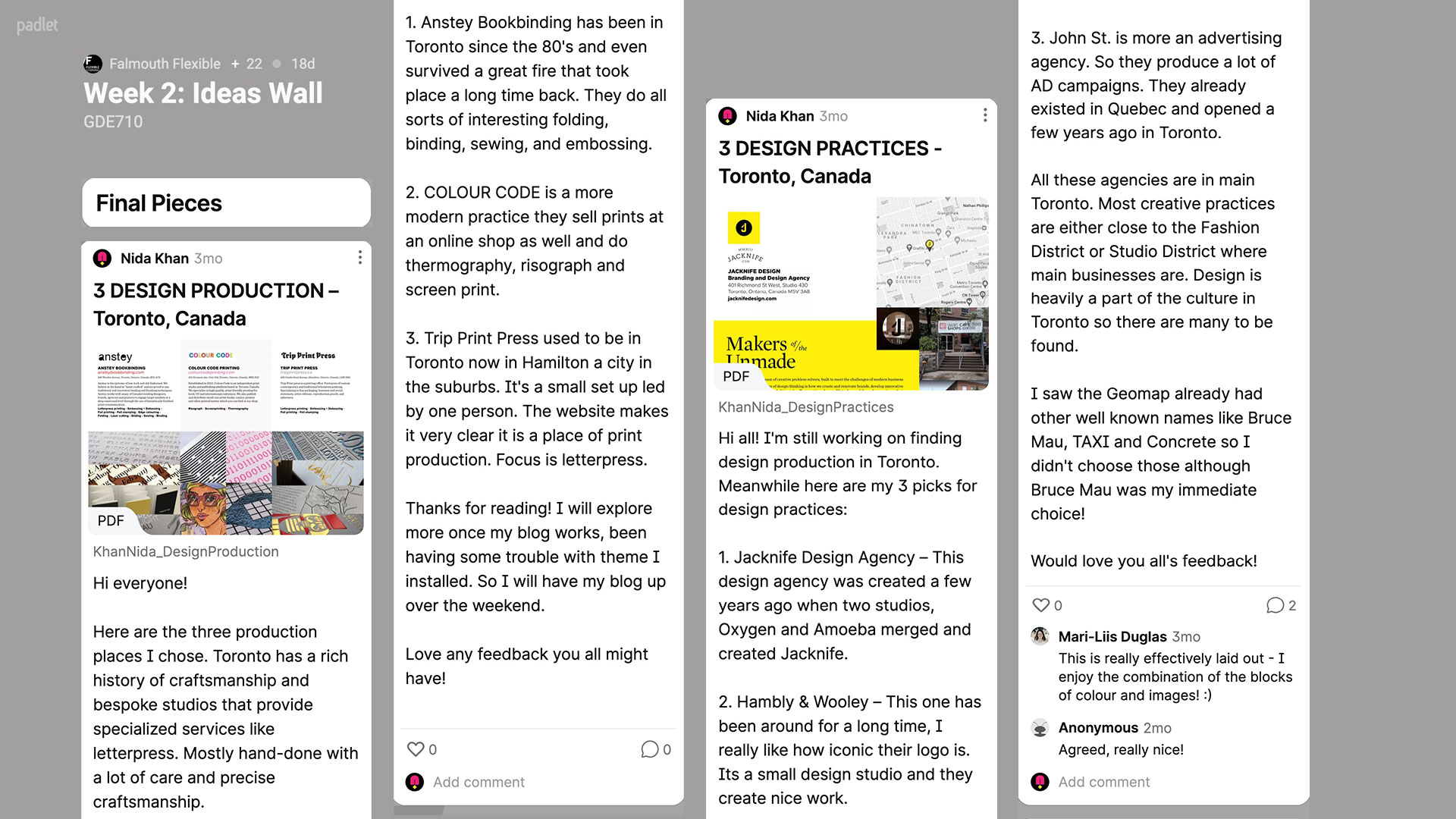
Ideas Wall
Here I share my comments on the Ideas Wall on my challenges.
Final thoughts
It was an interesting week. I enjoyed the research into Canada’s graphic design history. It was interesting to find out that there was no real compilation of this in Canada, and another designer had encountered this a few years ago and then he went about compiling it all in a documentary format. The Design Canada documentary was an amazing watch and it really made me appreciate the history of which I knew nothing about. I enjoyed looking into the practices and production places. I think if we weren’t in a pandemic I would have gone to the studios and interviewed the designers.
Thank you for taking the time to read this.
© Nida Khan, 2020 — All rights reserved.
Contemporary Practice
Week 1 • Introduction
Week 2 • Industry Today
Week 3 • Fields of Practice
Week 4 • The Self and Identity
Week 5 • Thoughts on Ideas
Week 6 • Noticing the Ignored
Week 7 • Research and Theory
Week 8 • Skills and Making
Week 9 • Message Delivered
Week 10 • Type and Page
Week 11 • Trends and Environments
Week 12 • New Steps
History & Futures
Coming soon...
Studio & Entrepreneurship
Coming soon...
Application & Interaction
Coming soon...