
GDE 710
WEEK 11
Trends & environments
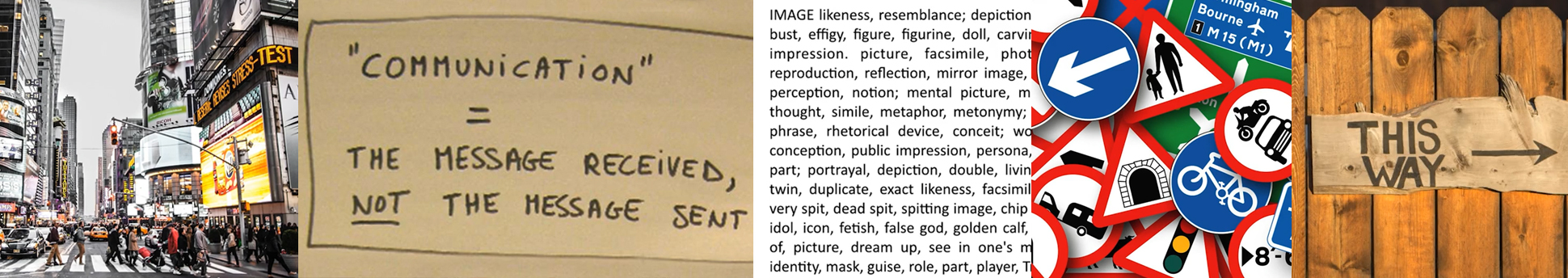
This week is a deep dive into the symbolism, meaning-making, message and media and unpacking meaning and distorting meaning. Looking into how visuals and language work together to convey a message. We explore message by looking into semiotics, symbolism and deconstuction the contemporary media message. The question driving the inquiry this week is:
What lies beneath?
Symbolism and Semiotics—Martin Hosken
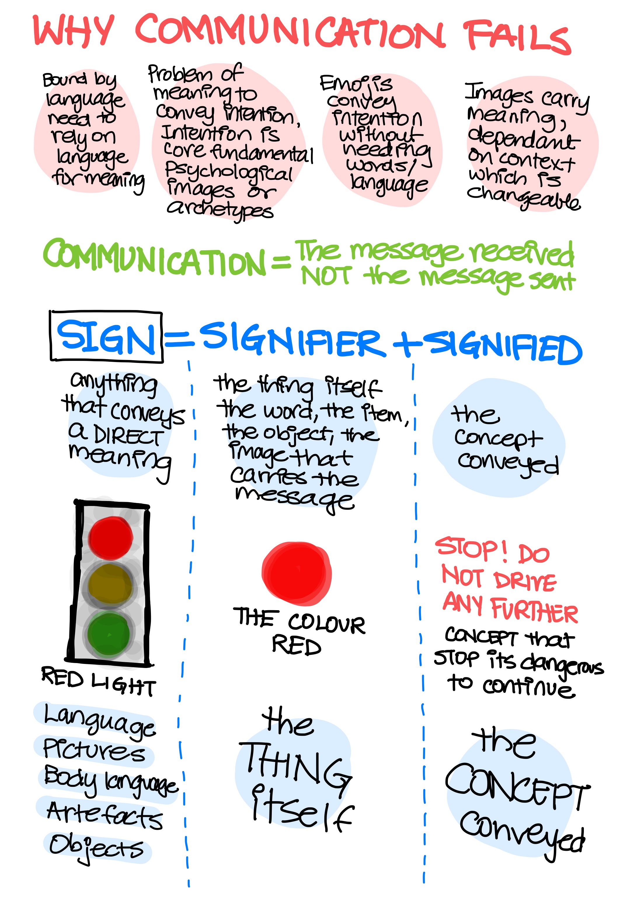
To unpick the message we must first consider the wider premise of communication and in so doing, it may be wise to firstly consider the possibility that it did not occur i.e. that the message did not get through—communication did not happen. Thus communication is not a given, and within its boundaries always lurks the notion of the measure of its success. Did the receiver receive the intention of the sender? As the playwright George Bernard Shaw once said, “The single biggest problem in communication is the illusion that it has taken place.”
Martin Hosken
Martin's lecture covered a lot of very interesting stuff. I've always wanted to learn more about how meaning is made and how concepts are conveyed in a way they are gotten at the audience end. Communication, both verbal and visual are the arena in which I play. As a teacher I'm always wondering how best to communicate ideas in a way that they are understood. As a creative director the messaging and how it lands becomes super important especially when it's presented in a variety of different media. Perception is also at the heart of the industry I am in, when you work for non-profits with lofty causes the messaging and story is the main star of the show.
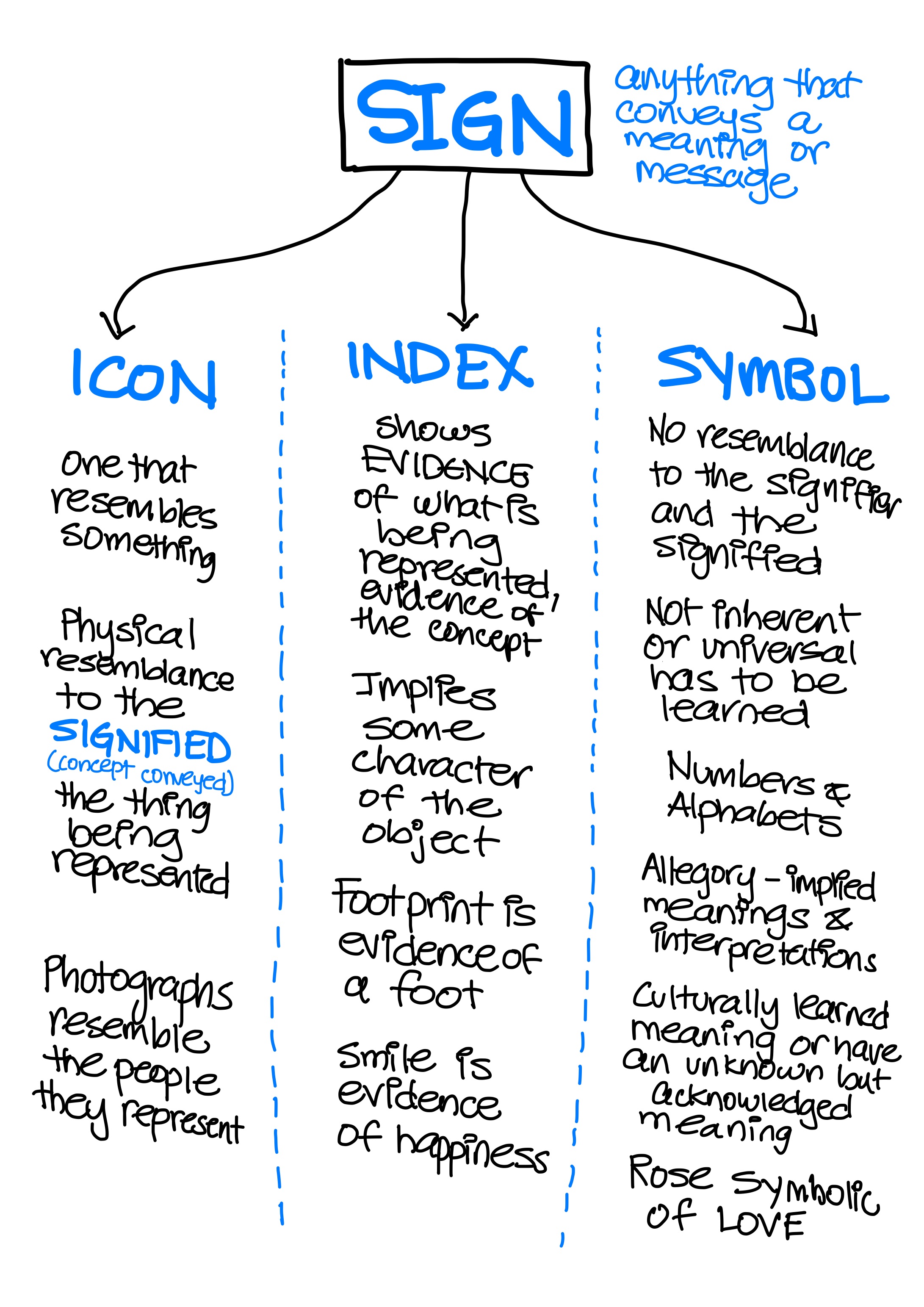
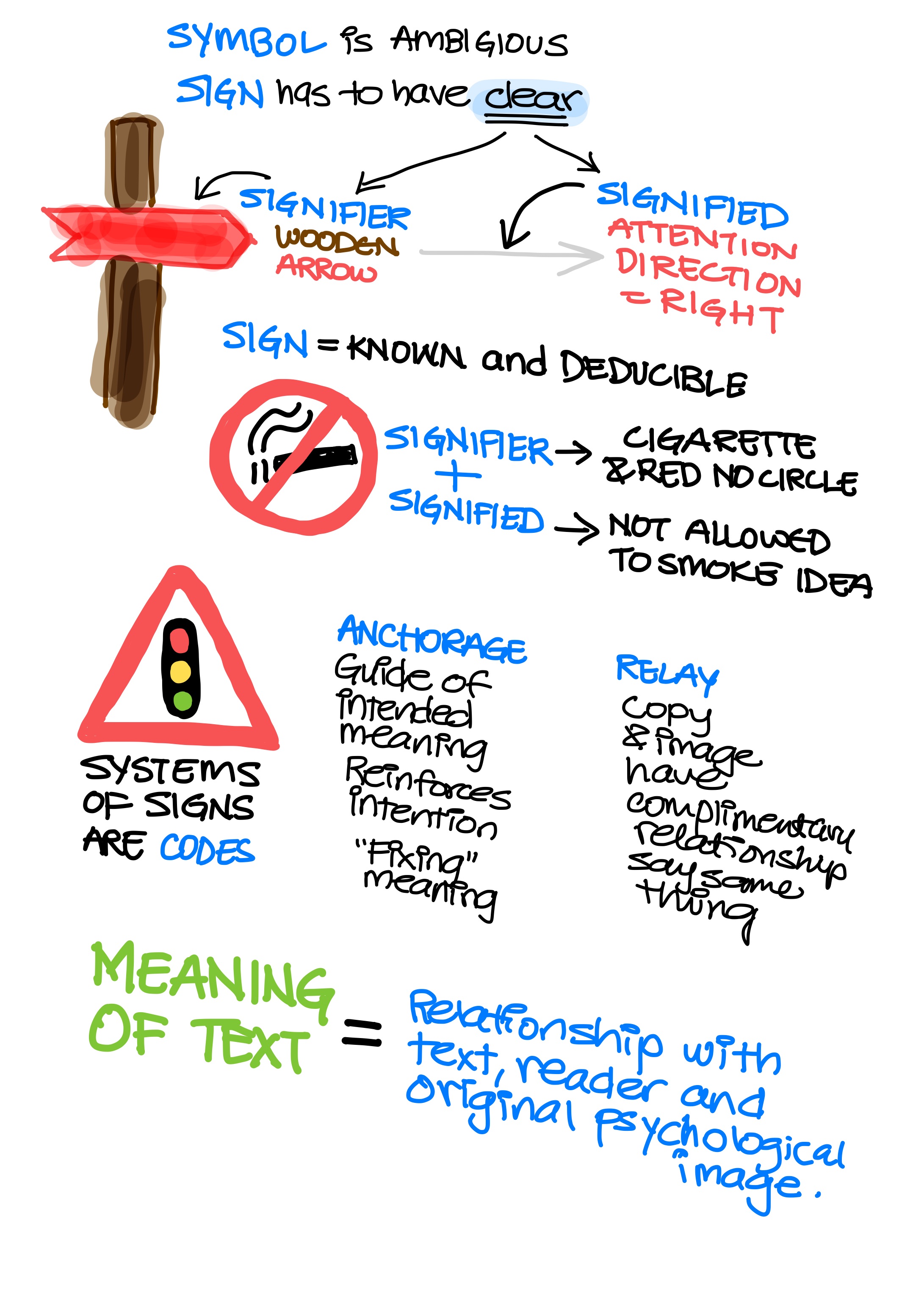
I learned a lot from the lecture. I haven't studied semiotics per se before and so this was all new information. I didn't have labels for SIGN, SIGNIFIER and SIGNIFIED in my conception of things. I think I refer to them differently mentally. Initially the terms were tripping me up and so I watched the lecture a few times and took notes.
One thing that confused me a little bit was when Maziar was making a comparison between SIGN and SYMBOL. Because a SYMBOL is a SIGN, and yet we were comparing the term SIGN being more clear and concrete and a SYMBOL being ambigous. I understood the distinction between the two, but the classification was a bit odd since one term was a subset of the other so the relationship between the terms didn't set it up to do a compare and contrast that way. I assume though this is a lack in my understanding because this topic seems deeper and more vast than the introduction presented here, and I need to learn more to have any degree of mastery over this area. If anything it has sparked in me an interest to learn more about this topic. I did not have enough time to read the books suggested as resources but the VISUAL SIGNS book is now on my reading list as this is definitely a topic I'd like to master.

Lecture—Parts 2 & 3
Tom from Regular Practice's lecture was a favourite for me this week as well. I loved the visual break down of the Olympics over time and place, seeing the various ways of depicting based on the city they were in. A great lesson in branding. The structure of analysis was comprehensive as was his critique and it influenced the way I approached the news story case study for my challenge. I chose to take that approach and really dive in and look at not just one story but how it was showing up in the landscape of other coverage in the same country.
Patrick Thomas Breaking News 2.0 Installation was interesting as an experiential exhibit. I would say it was a more intuitive as opposed to analytical execution, which he did say as the intention was to get people to question and not necessarily provide answers. I found the use of technology and paper quite intriguing as well as the choice of typeface to convey the everyday cheaper quality of the news. It was a really good example to show the spectrum and contrast between ways of interpreting and telling a story.
Workshop Challenge
CHALLENGE:
Case Study 1: Take one story to see how it is reported globally. Collect three versions of the same story from three different countries. How is it reported? Headline? Text? Unpacking meaning and distorting meaning.
Case Study 2: Take a brand and look at how it is delivered in different countries, e.g. alcohol, tobacco, transport, cars. Is it symbolised in a different way? Why might colour or typeface have been changed? Does it work at a local level and does it work at a global level?
Task: Please explore Case Study 1 or 2. Collect visual examples and upload onto your blog and onto the ideas wall. Debate your opinions with your coursemates – ensure you contribute and incorporate this into a short 500 word written critical review in your blog. Consider the impact the media has on your understanding of visual signs and symbols relating to that piece.
These case studies explore how society is manipulated by a message and how graphic design is deployed.
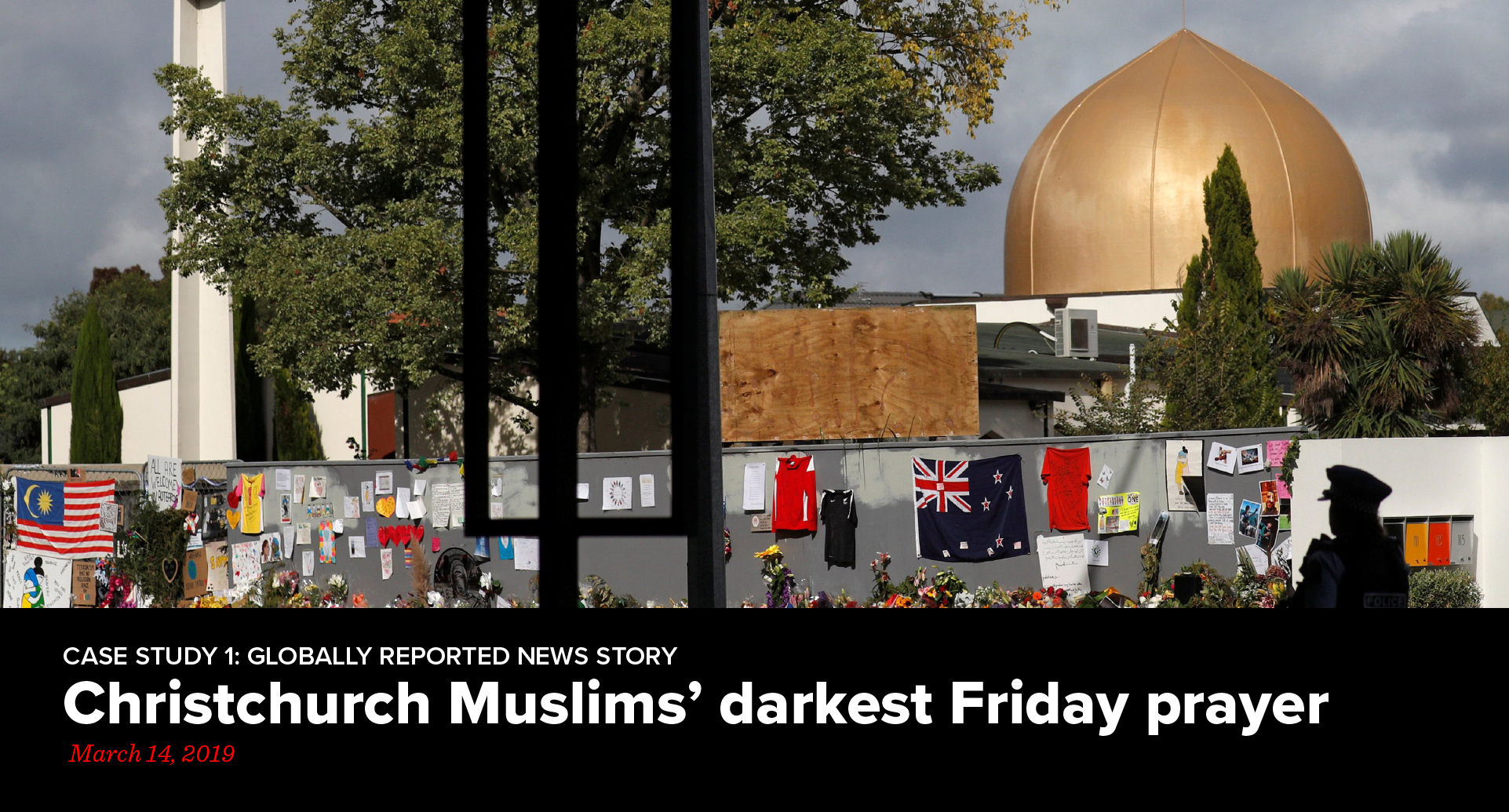
Case Study 1—Global news story
I chose to do a global news story for my challenge.
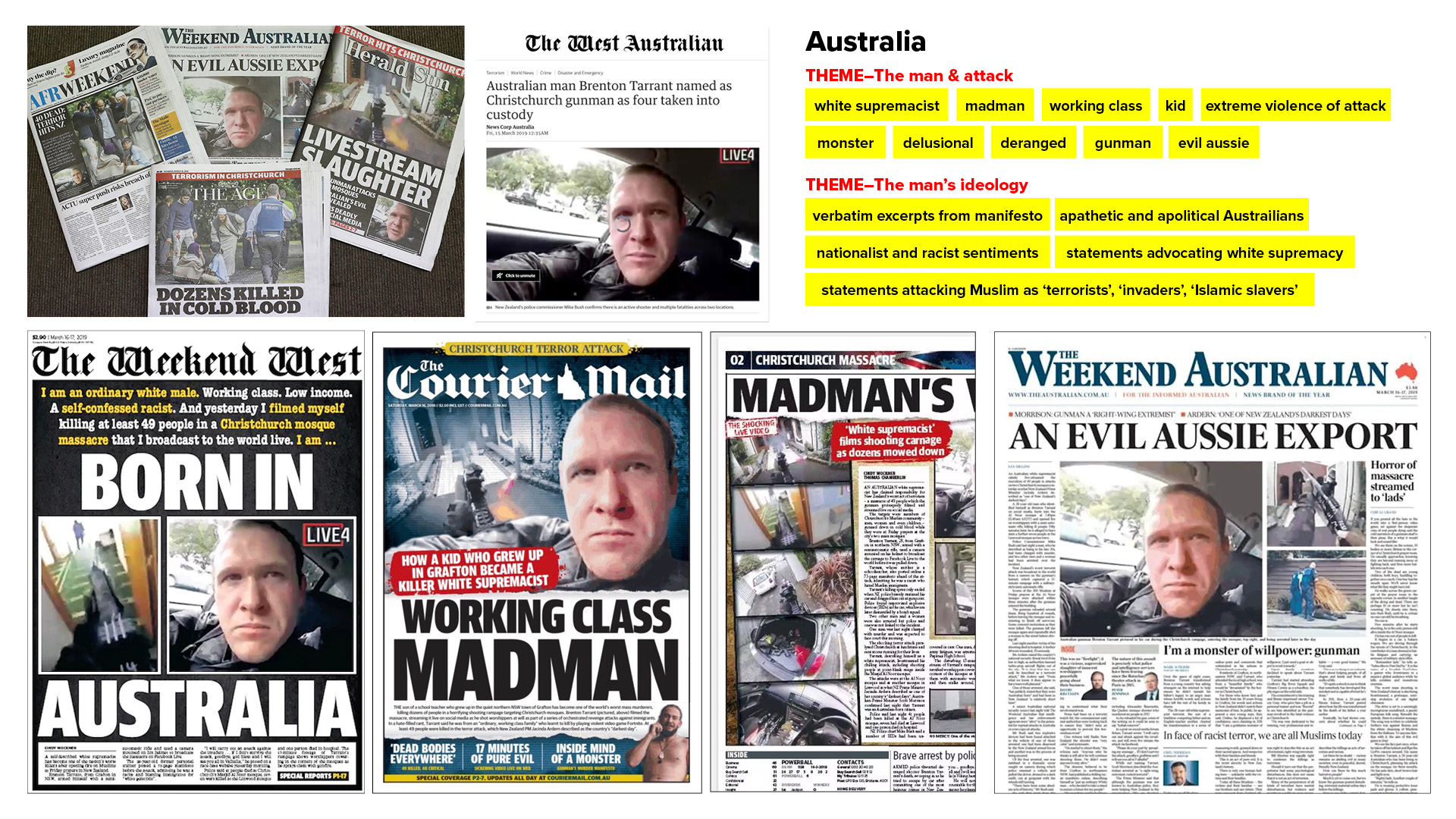
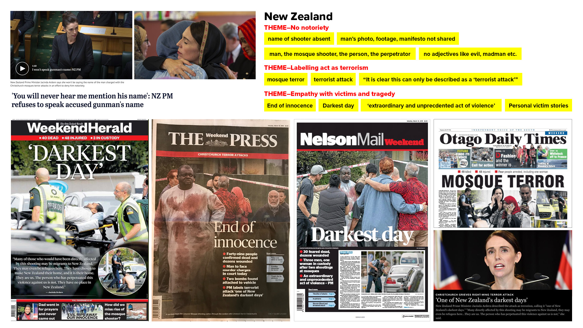
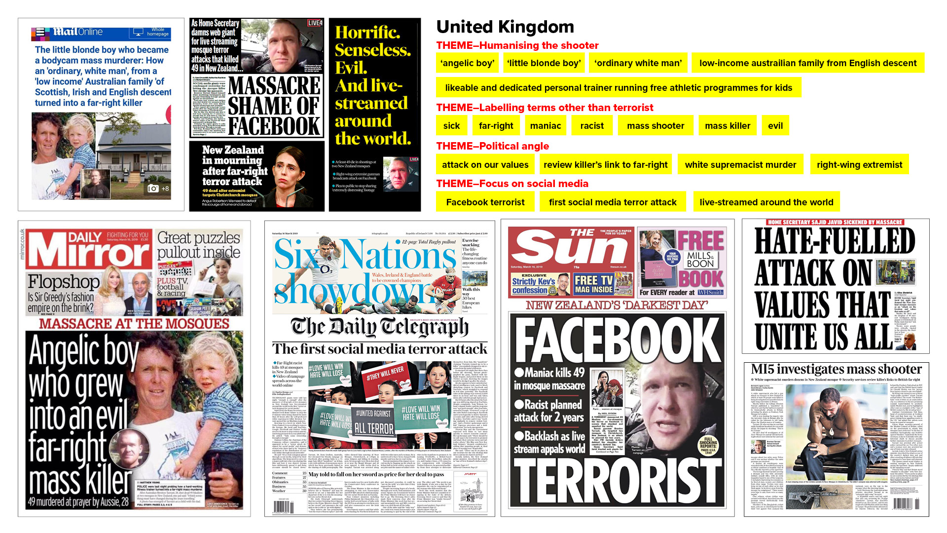
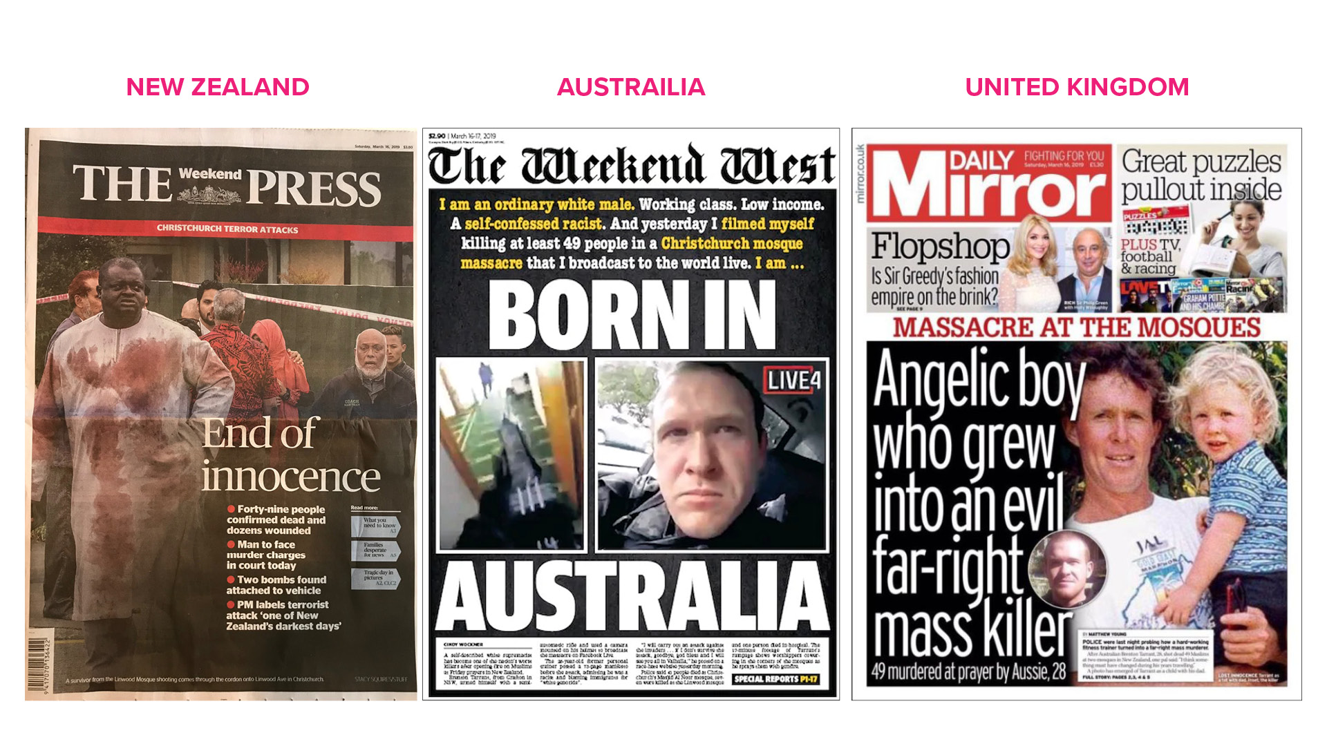
I chose to cover the New Zealand Christchurch mosque shooting story where the shooter had livestreamed the shooting on Facebook Live. I decided I would research and see how the news had broken globally and how the messaging was conveyed. My intial idea was to look locally at US and Canadian news coverage and compare it with the Muslim world, so Turkish news TRT or Qatar-based Al-Jazeera, and compare that to the local New Zealand news. However during my research, I found that within the story itself the 3 regions presented themselves to me, without the bias of a Muslim newsroom. The incident took place in New Zealand, so that was my first choice. The shooter was British in that his parents were from London, that gave me my second region, UK. The third region sprang from where he was born and lived, Australia.
I detail my research below in images of the collections of news stories and a depiction of the three I ultimately chose. Overall this exercise was very enlightening as I clearly saw how images and words were being used to distort meanings. And how they could be used to tell better, clearer and truthful stories. Perception and meaning-making and how much it depends on how it's portrayed visually and verbally was my biggest takeaway. Going through the coverage was also emotional and tough for me, as it brought up feelings of sadness.
Acts of terror against Muslims are often not represented fairly in the media. Numerous acts of violence fuelled by Islamophobia, are often reported without much care or compassion for the Muslim community.
Western media has often been criticized for choosing not using the word “terrorist” to describe a perpetrator of violence against Muslims. The Christchurch massacre in New Zealand drew the same criticism by Turkish and Middle Eastern news media outlets like, TRT and Al Jazeera, when news outlets in the "western" world like the UK, USA, Canada and Australia chose a distanced approach and chose not to use the word 'terrorist' to describe the shooter of the incident.
New Zealand's news coverage of the Muslim massacre at the two mosques in Christchurch on March 15, 2019 was different. Whether other countries got it right or not, if you were Muslim, anywhere in the world, you finally felt seen. How? Simply by New Zealand prime minister, Jacinda's choice to label the shooter a 'terrorist' and the mosque shooting an act of 'terror'. In spite of Jacinda's framing of the incident: "It is clear that this can now only be described as a terrorist attack..." western news outlets in other countries chose not to use the word 'terrorist' to describe the shooter.
New Zealand's news coverage of the story showed compassion for the Muslim community. Prime Minister Jacinda clearly adopted the "no notoriety" stance by saying, "You will not hear me mention his name..." The country's news coverage adopted the same empathy and instead focused on the victims, the survivors, their names, their images, and their stories. The shooter was left nameless and newspaper themes centred around the emotions being experienced. It gave the tragedy it's due space to be felt and seen for what it was. Not trying to manipulate it for any political or other focus. Never before have Muslims in a western country experienced the kind of support and kinship as was seen in New Zealand, at least in today's day and age.
Australia—where the perpetrator was from—took an entirely different approach. All the Australian newspapers ran extensive backgrounders on the attacker, and all published extracts from his manifesto, with a few verbatim fragments. There was a pattern to the verbatim extracts chosen: statements that advocated white supremacy or promoted nationalist and racist sentiment, and statements that attacked Muslims as terrorists, ‘invaders’ and ‘Islamic slavers’. Big images of the shooter and images from his footage were seen. Hardly any coverage was given to the victims.
The UK also took a similar, but even more distanced approach, than Australia. Stories seemed to humanize the mass murderer by showing images of his childhood as a baby in his father's arms. Words like 'angelic' or 'little blonde boy' were used. He was also humanized as an adult: 'likeable and dedicated personal trainer running free athletic programmes for kids'. Messaging also got political suggesting influences and links to the far-right. Interestingly enough UK media did use the word 'terror' and 'terrorist' but in the context and criticism of social media.
The most striking feature of these three comparisons between the New Zealand, Australia and UK media coverage of the Christchurch attacks was the gulf in the amount of attention paid to the victims. It was eye-opening to see how imagery and words can be used mass media to distort messages and create a perception of 'us' and 'other'.
[Approx 500 words]
Ideas Wall
Here I share my comments on the Ideas Wall on my challenges.

Final thoughts and reflection
This week was a mix of emotions. I felt really excited because the topic covered was something I’ve been wanting to learn about and lean into. I felt overwhelmed with all the news stories and varied perspectives I was looking at and reading. I felt a deep heartache as I recounted the tragedy I was researching and I felt motivated to puch through and become critical about the information I was uncovering. I also felt a little unsure of whether I was doing the writing right. So yeah a lot going on! Ultimately glad that I tried something different instead of branding. Got some good feedback on the Ideas Wall from Yasmeen.
A side effect of this is that I don’t trust the news anymore. Such variation in reporting!
Thank you for taking the time to read this.
© Nida Khan, 2020 — All rights reserved.
Contemporary Practice
Week 1 • Introduction
Week 2 • Industry Today
Week 3 • Fields of Practice
Week 4 • The Self and Identity
Week 5 • Thoughts on Ideas
Week 6 • Noticing the Ignored
Week 7 • Research and Theory
Week 8 • Skills and Making
Week 9 • Message Delivered
Week 10 • Type and Page
Week 11 • Trends and Environments
Week 12 • New Steps
History & Futures
Coming soon...
Studio & Entrepreneurship
Coming soon...
Application & Interaction
Coming soon...