GDE 710
WEEK 3
Fields of practice
We begin week 3 looking into globalization, it's effects, and also inquiry into what graphic design is, questions around terminlogy and categorization. It was somewhat confusing at the outset but as I dwelled and played with the content this week it started to come together. The main question driving this week's inquiry was:
What is the scope and what are the boundaries of graphic design today, current and future?
The Effect of Globalization
It was interesting to hear the different design practitioners in Lecture One discuss how globalisation has impacted their practices and what their views are about the idea of globalization. While listening to the designers speak, I felt I could appreciate their answers more because I had 'met' them in week 1 and had a better idea of who they were, what their work was all about, and how they produced their work. This also made it easier to appreciate their point of view on globalisation. Here I comment on my reflections on each of their views.
Simon Manchipp
I think it’s encouraging greater collaboration, it’s encouraging bigger ideas and then it’s allowing us to work on a much bigger canvas.
Simon Manchipp
Simon Manchipp seems to think globalization is a terrific idea. He views it as a vehicle for inspiration, for knowledge to be shared, for advances in technology and for enhanced communication. When he talked about how influences like "Indian approaches to managing people" and "Chinese medicine" is entering "mainstream thinking" it reminds me of the kind of cross pollination that occurs when two cultures fuse. When two very different ideas seem to fill each others gaps with ideas inspired by being exposed to a different way of thinking. I personally think that is how ideas evolve and is exactly what makes creativity so exciting. I also agree with Manchipp on his view that it is an "unstoppable force". The advancement of technology has very much contributed to it, in a sense caused it, and with the pace at which technology evolves its bound to touch everyone in one way or another in essence opening the world up to anyone who can open up a computer, or a tablet or mobile phone.
Sam Winston
Globalization has added a lot of speed to life, it’s added a lot of connectivity to it, but I don’t think it’s necessarily changed some quite basic things about how we operate.
Sam Winston
Sam Winston seems at first to not even acknowledge 'globalization' as a word that means somthing to him. He is hesitant that it has affected his practice. He seems to view it as something that effects us all from an economic sense. As if it's something negative that he "has to push against" almost as if it isn't something that would allow him to be creative in the way he is. Since he creates print pieces I think the nature of his work and how he likes to produce things in detail in analogue fashion at times might contribute to this. I can see why it would occur that way to him. He does bring up an important point though which I personally agree with. That humans are still the way we are, and we appreciate the things that make us human like connection, and meeting in person as opposed to over an email. I think the pandemic has really made me appreciate the collaboration or creativity that occurs when we are out and about with other people in person as opposed to behind a screen infront of a computer. So while I agree a lot of speed has been addded to life by globalisation, and made things easier to do, in a sense it has made other things technology can't replace a bit more precious. I'm taken back to the thought of Paula Scher and her 'painted maps' and how those emerged as her way to cope with the loss of working with her hands. So in conclusion I align with some of Sam's sentiments, but not entirely with his overall view of globalisation. And it can also mean that practioners of smaller boutique practices may not feel that globalization affects them as much as other practices that are larger and more varied.
Regular Practice
...it’s a very smooth process because when we do speak on SKYPE, we have to make sure that we talk about all of the things that we need to get there, because you can’t just call up very easily. Actually, it becomes quite a slick process of not an enormous amount of forwards and backwards.
Regular Practice
Regular Practice brought up the notion that globalization allows them to work with clients in different countries. Where as in the past that would not have been possible without globalization. You would physically have to be present to work with clients. Another thing that I thought was interesting was the notion of human behviour indicated by the Regular Practice when they say because you're meeting with a client abroad on Skype meetings have to be efficient. So you're more intentional about them, and more purposeful in making sure that you talk about all the things that are important. As someone whose worked as a designer in a corporation, a lot of meetings can be filled with non-essential stuff which is often no very helpful.
I also really resonated with the idea that the world is ones marketplace with the effect of globalization. You can have your pick and get quotes from various vendors for different services, in Regular Practice's case they mentioned print vendors. You are able to get different prices, and different kinds of service. Sometimes you can source the production of a piece in another country and it is more economical. It may also mean a certain kind of product is unique to a certain country and without globalization we would not have so many choices.
Sarah Boris
Globalization... it’s given me a lot of opportunities... I placed an ad in the local newspaper inviting people to come and visit the exhibition. I also sent a brief and that was an opportunity to face local people, tell them about my practice in London and it actually brought me business in. I guess that was a really nice leap from more global to local experience.
Sarah Boris
Sarah presented yet another different way of looking at globalization that I hadn't instantly thought of. She mentioned how her work got more exposure in a different market, and how she was able to go do a residency in another country, and have locals viewing her work in a new place. It was also interesting how she went into a new enviroment practiced there and also reached out to people their via newspaper AD. It shows how one can become accessible in a different environment away from where one's home practice is. It reminded me of my own practice. I live in Canada, but I actually work for a research institute remotely as their creative director. I only got the opportunity after I reached out and shared the kind of work I could do for them. Exposing myself to a different market, opened up opportunities inside that market as well. I went and spoke at the SxSW conference on a panel in Austin, Texas. This would not have happened if globalization was not affecting the world today the way it is by making things more accessible to us as designers.
Intro Design
...the other important thing about engaging with people, whether it’s a meeting or a phone call, is that it’s amazing how quickly you can clear up what was never a big issue in the first place. The danger of dealing, of working online, through sending PDF via email and stuff, is that potentially very small problems can turn into what seems like a huge problem and then a meeting dispels all of that.
Intro Design
Intro brings up a good point about globalization affecting us so that "anyone can do anything" from behind a computer screen. Whereas in the past they find you had to go through a process and get to the place where you were recognized as someone with the skills and expertise to be a design practitioner. They also talk about how supplementing online interactions for real communication can cause misunderstandings. I think both points are valid to a certain degree. I think while it can seem like anyone can do anything at the end of the day talent and skill show. And you are still recognized for what you bring to the table. Globalization has made it easier and I would like to think that is a good thing. It's good for people to collaborate and engage with each other and come up with ideas. It broadens our horizons and collective knowledge. I agree that misunderstandings can happen over email and text. To that I would say real communication still is talking to a person. And like Regular Practice said that we should use the advances of technology to have more intentional meetings with one another and picking up the phone, or having a virtual meeting can really be effective at doing that. It depends on how we decide to use the tools we have.
Harriet Ferguson

With cultural diversity comes conceptual diversity, which in turn leads to ideas and designs that surprise, delight and excite—unexpected, rather than expected.
Harriet Ferguson
Harriet brought up some key points on the effect of globalization by taking us into her world at Pearlfisher. What I like about Harriet's lecture was that she very clearly stated the main key themes she was going to address. I was not a big fan of her delivery because it seemed scripted and as if she were reading rather than speaking to the audience the way the presenters were in the first lecture. It made it easier to connect to them. I thought the content and perspective she shared was great inspite of her delivery. I will share here my thoughts on the key themes she shared around the topic of globalization.
Collaboration
She brought up a great point about when you work in a team you are exposed to the diversity of skills and knowledge and also different opinions and perspectives of people. When this is scaled to a global level it opens up a "treasure trove of talent". I think she's absolutely right about this. Especially when people on the same team or even the same project are working from different parts of the world this also gives us access to a cultural adiversity and a shared knowledge pool that otherwise would not be available. I see this in my own practice, as my team of creatives are spread across timezones and parts of the world. I also find it interesting how what one person can accomplish or play with on a project becomes so much more than one's own individual skillset because if you can't do something yourself or don't have the skillset you can tap into the expertise of other creatives and bring alive ideas by sharing a project.
Inspiration
Harriet brought up an important point that having access to the internet and having the same sort of visual research show up on pinterest boards can create a lot of same looking things and we can fall into the trap of imitation. This reminded me of an ideation workshop I took with Marty Neumeier, in which he talked about the originality of ideas. He shared how if we need to come up with an idea and we tap into the same domain that will not allow us to produce ideas with novelty. I think Harriet's example of the packaging design of Beoplay illustrates this concept well, where the obvious choice would be to look at the domain of packaging, or even the domain of music to see what's out there. Turning to books, magazines and editorial design although not an obvious choice really elevated the design of the product to exhibit novelty.
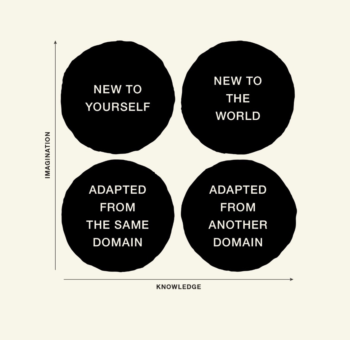
The ability to produce original work is a rare and valuable asset. It lies at the heart of innovation, strategic differentiation, and societal progress. It imparts a quality of “never-before-ness” that can command attention, fill voids, and create wealth. By definition, you can’t be original by copying an original. You have to start from a different place.
Marty Neumeier
Visual culture
I think Harriet brings up an important point about how things can mean different things in different parts of the world and to different cultures. How something as simple as colour can have opposing interpretations. As the world becomes more globalised how do brands then cater to the world and the different people in it? I agree with the sentiment that simplicity in design can be the key here. Even though there are difference in interpretation that become activated when the world is your market, I believe that the underlying core principles of design spell out a common language. We all have shared visual vocabulary that means the same to all humans. Tapping into the basics and keeping things simple can make interpretation open enough to work across a larger gamut. I thought the example of Apple as a company that practices good design is also very revealing. Apple has a consistent image and way of being, and it has stayed true to that. Even if it starts to sell in new markets it's own unique identity and simplicity keep it relevant and liked around the world. I think we don't need to try and become everything to everyone because we then in reality become nothing to noone really.
Future of design?
So then we arrive at what does any and all of this mean for the future of design practice? I agree that authenticity is paramount. Althought in today's world that has become an overused word. If a brand can be and show that it is in actuality all that it says it is, I believe it will have enough integrity to stand in the marketplace and also be loved by it's audience. I think designers when designing need to take into account the people they are talking to. It is like any other relationship. Humans will value design that speaks to them, tells a story, delights, takes them on a journey, is clear, simple, fresh and beautiful. There must be substance behind just what is visible. And in Harriet's words, as designers we must:
- Be genuine, no bull;
- Tell the story, one that the brand you are designing for can truly own;
- Find a unique way of talking that stands out and is fresh in the category;
- Keep it simple, consumers have enough on their plates already;
- Think global but act local;
- Consider the impact on the planet and what the brand can give back;
- Make it fun – an emotional engagement with a brand will make it more memorable.
Harriet Ferguson
Workshop Challenge 1: Design terminology
CHALLENGE: Explore the categories of the D&AD award winners 2020 and consider how this impacts on your views of design terminology, consider the overlaps and points of change, difference and similarity. Write a short 500 word synopsis on your blog. Your blog should also demonstrate further reflection and examples of practice viewed.
Labels have always fascinated me. How we as humans have this need to categorize things and give them a name. I think it works to give things names so that they exist for us and we can make them distinct from everything else. What that terminology should be is another question.
When I ponder over my past years when I was fascinated by scientific subjects like chemistry, biology and physics. You find this notion of nomenclature. Ways of naming things, ways of measuring and cataloguing variety and systems. You also find this notion of agreed upon standards. I think because such subjects are more left-brained—for lack of a better word— putting things in logical systems works. Finding naming conventions also works.
With something like design, which interestingly can be abstract and quite ordered as well, I think it becomes harder because ideas emerge and flow, and cross-pollinate and fuse, and dance and sing and do a thousand other things. I think there is also the notion of interpretation. If there were a fixed nomenclature for how we define the work we do, who gets to decide what the right call is? Is it the one who creates? The designer? Or the one who perceives? The audience?
In 1963 the D&AD had 1 category: Advertisement and 1 winner. For the next 24 years, categories and winners averaged anywhere from 2 to 8. In 1988 something must have happened because 18 categories emerge, and 489 winners. This past year 2021 they have 41 categories and 1229 winners.
For the year 2022 D&AD is allowing submissions in the same number of categories: 41. Not to mention that each category is roughly averaging between 3 to 15 subcategories. When I went through each parent category and the subcategories, I also found that labels could overlap. So, a piece could be submitted for “Writing for Design” for instance, and the copywriting would be judged, whereas the same piece could be submitted for “Graphic design” and the layout and design would be judged. This is making me think that perhaps the categories evolved based on the kind of areas about a piece that were being observed.
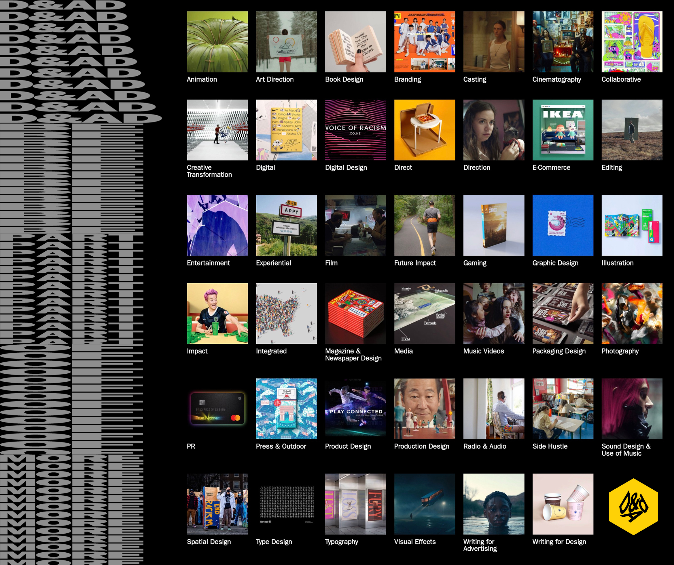
Categories like Digital Design: Data Visualisation, Branding: Sonic Branding, and categories related to use of XR, VR or MR and others to me show points of change. Something having happened in our environment, showing the effect of the advancement of time, technology, and globalisation. These categories would not have existed if the tools that made them did not come to be.
I think there are certain terms that as designers we have all used, these I would consider as overlaps or similarities. We all know what they mean. Terms like Typography, Advertising, Graphic design, Book design, Type design, Logo, Branding. I don’t think designers from different places would define these terms any differently. Differences in terminology from my point-of-view show up inside interpretation. When I see work like that of Non-Format with their frayed analogue type. Or the artist who uses typography as a motif in his art but doesn’t consider himself a graphic designer, but rather an artist working with type, then there is a point of difference that emerges. What we think are descriptors and how the artists themselves choose to describe what they do.
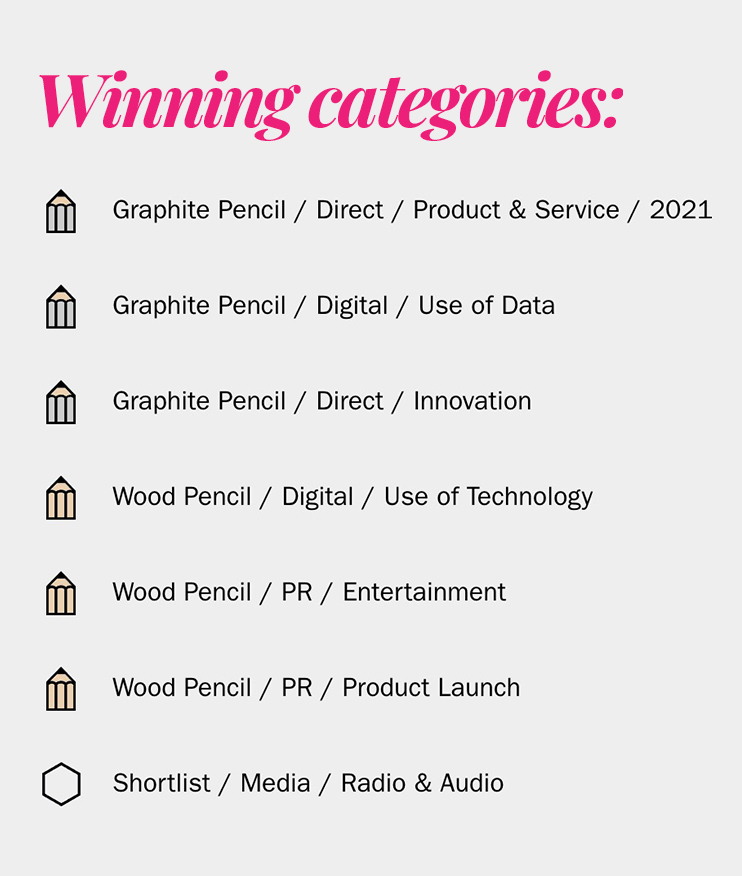
A project that caught my eye was "Saylists" it actually won 6 pencils in entirely different categories. The submission was an animation for the launch of a playlist of songs analyzed to help kids with speech impediments sing along to repeat problematic sounds and so make speech therapy fun instead of boring repitition. I think the categories it won in worked but I still thing the project has so many overlapping components that it can't be packaged into a neat box. It's a product, a collaboration, it's promotion uses animation, and illustration, the science behind it uses algorithms, and data analysis, the actual product though is just a playlist of curated songs, so not exactly a graphic design piece per se. I would have entered this promo video into the animation, illustration, storytelling and video categories as well. I think the designers, copywriters and animators did a great job on the messaging, highlighting the paint point, expressive use of typography and conveying the benefit of the product to the viewer.
Workshop Challenge 2: Breaking Boundaries
CHALLENGE: Reflect & Produce – We are going to start by exploring the terminology and language that we use in the area of graphic design. To begin with, list 10 different types of graphic design practice today. Write down your thoughts on your blog.
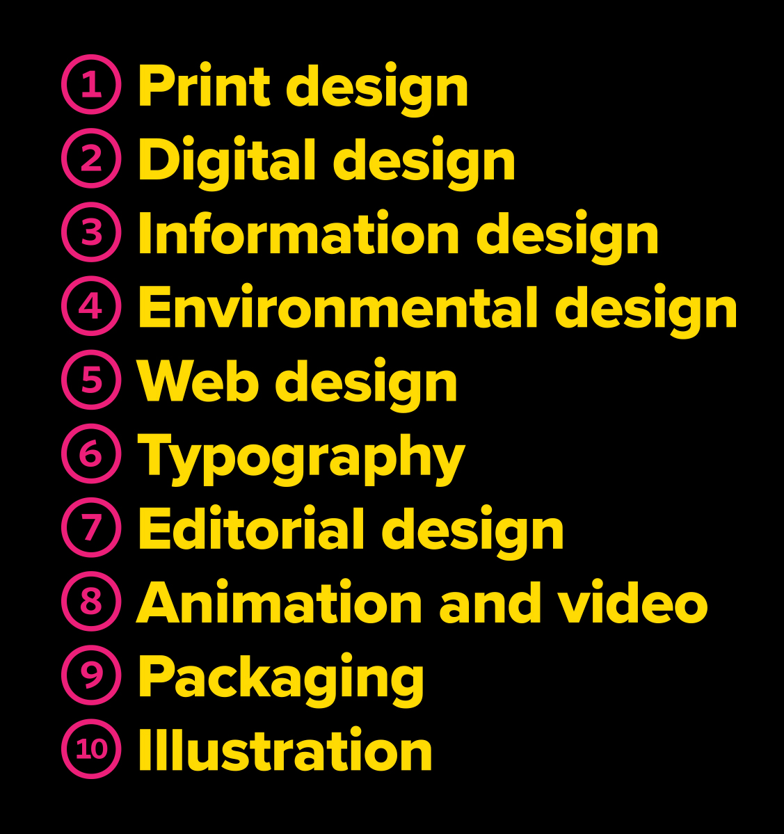
Here is my list of 10 different types of design, that I believe fall under the umbrella of GRAPHIC DESIGN:
Let’s now consider classic design models and definitions, and what breaks these boundaries. We believe in graphic design as a term but what are the areas that you believe fit under the umbrella of graphic design? Choose a piece of design that breaks definitions of design practice and write a paragraph describing this practice. Come up with a new term that describes this area of work.
In my role as creative director for the past few years, and having done the art direction and graphic design for various projects, I have dabbled in all the 10 areas listed above that I believe fall under the umbrella of graphic design. I have learned that all these areas can be used to convey a message and create meaning and that often times the executions overlap, and the best way may not be in just one of the areas alone.
The piece of design that breaks the definitions of design practice that I chose is graffiti artworks around the world by artist Ben Eine. He is a world renowned graffiti artist who paints big letterforms around the world. The biggest of his works is visible from space. This is expressive typography, it definitely creates an impact in the space and is conveying a message, and expressive one. He calls himself a LETTERFORM ARTIST. How would we categorize his work I wonder? Is it typography? I lean yes, but then a part of me also leans no. Is it lettering? Is it graffiti? Is it type design? Is it graphic design? He is not necessarily following all the rules that come with the use of typography all the time, but then David Carson didn't either and his work was considered design and not art. Is it environmental design? Is there a reason for the way the letters are shaped? I see an expressive side in the VANDALS depiction for instance. Something I teach design student, how to use and shape typography to convey a visual expression of the word. In a way his letterforms also function as a kind of signage. I would not categorise his work as completely graphic design or even type design or even just completely art, I would maybe call him a graffiti artist who paints with typography. He's not distorting letterforms, even though he's not using the formal typesetting laws of spacing and hierarchy.
There are graphic designers who paint large letters in environments, like Paula Scher. I would not consider that art though, as it has a function. Sometimes informational like way finding, sometimes in the realm of experiential via environmental design to indicate where one is situated or functioning as a label or signage of sorts. I think the distinction here lies in the intention to bring form and function together to communicate an idea to an audience.
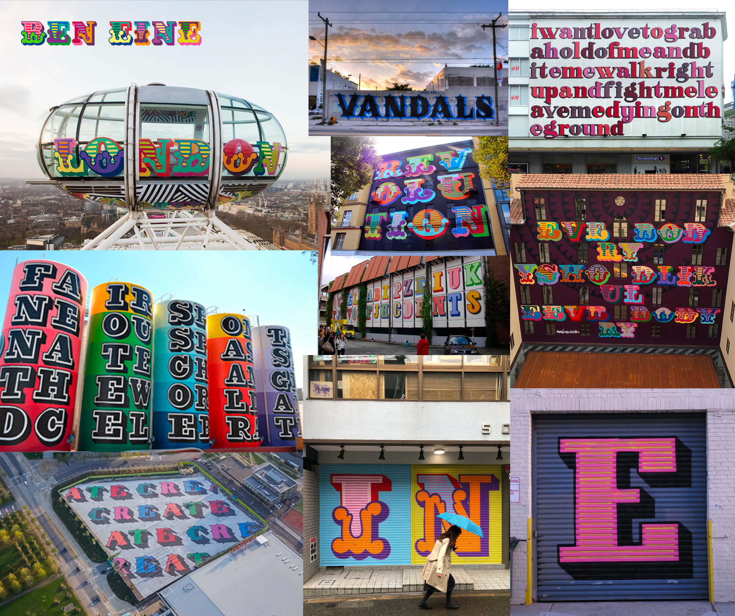
The term that I could devise for the kind of work Ben Eine does would be: TYPOGRAFFITI — coming from the marriage of the two words TYPOGRAPHY and GRAFFITI. I like how the sounds of the two words and letters GRA provide a place of overlap, so in a sense the utterance or usage of the word itself is a kind of fusion that conveys the intended meaning.
Ideas Wall
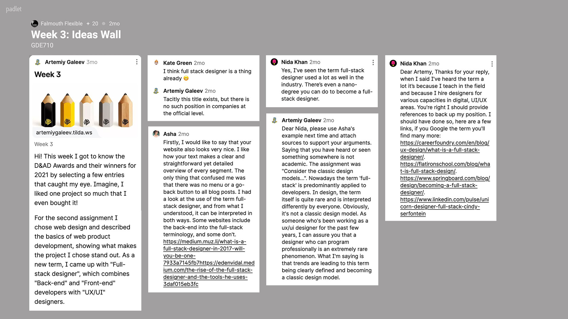
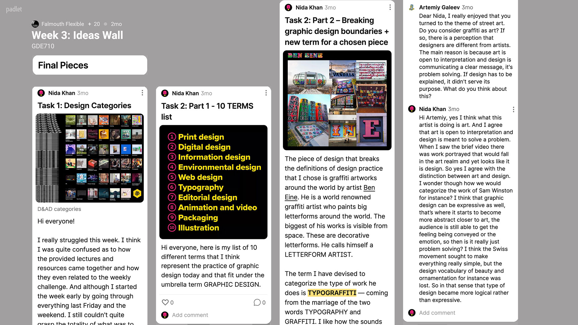
Here I share my cocontributions to others on the Ideas Wall, and comments left by others on my challenges.
Final thoughts and reflection
This week was a bit confusing for me. I kept going in and out of a nagging feeling of “Am I doing this right?” I think partly because it was less making and more thinking and analysing. And also because there wasn’t much discussion initially regarding the challenges on the blog. I guess we were all trying to ‘figure it out’.
I got a comment from Artemiy on the Ideas Wall that also made me question if I have even gotten the challenge right. When I think back to the weekly challenge video and remember the designer making furniture and wrapping it with thread, or the designer using big bold type to create paintings, I think I am on the right track.
When I ponder over expressive typography or even Sam Winston’s work I also believe that I did the challenge right. I guess it brought up the debate between art and design and which is which. Which funny enough was also part of the entire week’s inquiry. How can we define what it is that we do? I could see the debate arising, as it has across time and in history, between those that believe design to be entirely functional as opposed to beautiful. I believe design is definitely solving a problem however I also believe, at the same time, that design is also about form, beauty and not just the intellectual fulfillment of a brief but the expressive, the emotive and the intuitive part of the expression and preception of meaning as well.
So while a part of me felt maybe I could go back and revisit, I didn’t. I decided I was content with exploring how these definitions emerge for me over time, and for now I am ok not fully knowing the answer.
Thank you for taking the time to read this.
© Nida Khan, 2020 — All rights reserved.
Contemporary Practice
Week 1 • Introduction
Week 2 • Industry Today
Week 3 • Fields of Practice
Week 4 • The Self and Identity
Week 5 • Thoughts on Ideas
Week 6 • Noticing the Ignored
Week 7 • Research and Theory
Week 8 • Skills and Making
Week 9 • Message Delivered
Week 10 • Type and Page
Week 11 • Trends and Environments
Week 12 • New Steps
History & Futures
Coming soon...
Studio & Entrepreneurship
Coming soon...
Application & Interaction
Coming soon...